Turning Cabs into the Perfect Detox Reminder
Context
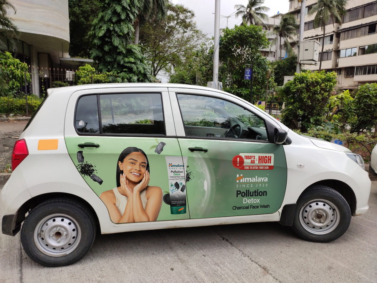
Himalaya was running a cab branding campaign for its Pollution Detox Charcoal Face Wash, targeting high-pollution cities across India. The media plan was clear: intercept urban audiences during their daily commute, the exact moment pollution exposure peaks.
Our role?
Create a cab panel creative that doesn’t just get seen, but gets felt.
Something that grabs attention at a glance, while communicating a skincare promise with clarity, credibility and urgency.

The Challenge
3 Seconds. One Lane. One Line.
Cab branding isn’t a storytelling format. It’s a billboard on wheels. You get a blink-and-miss moment, often from a distance, through traffic, behind tinted glass.
We needed a hook that:
- Spoke to pollution pain in real time
- Tied back to skin health instantly
- Reinforced trust in Himalaya
- Delivered brand and product clarity in one tight visual composition
The Idea
When AQI Becomes a Call to Action
We led with a hard-hitting, high-relevance headline:
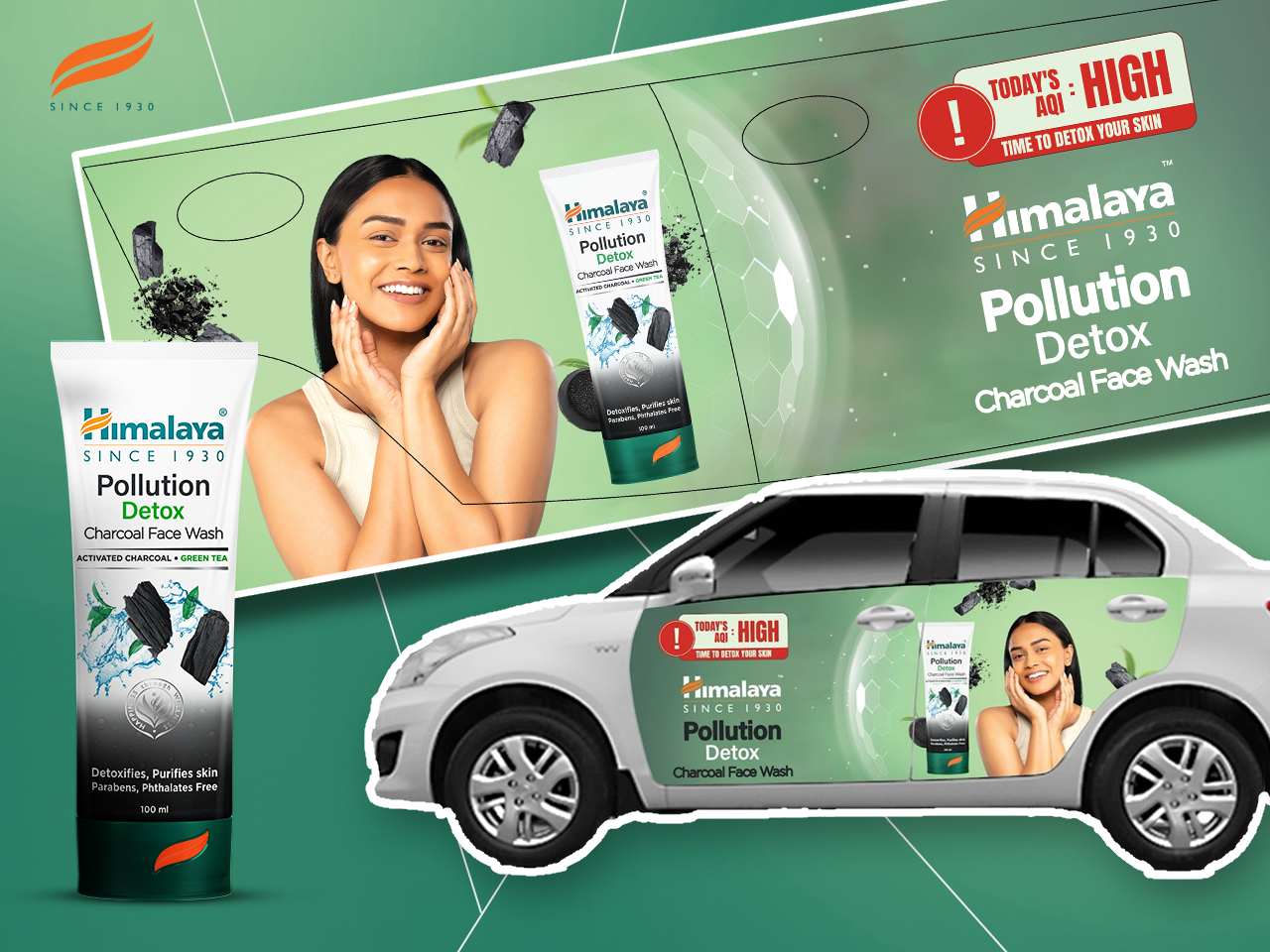
“TODAY’S AQI: HIGH
TIME TO DETOX YOUR SKIN”
This wasn’t just wordplay.
It was a real-time, contextual trigger transforming air pollution data into an emotional nudge. While waiting at signals or walking past a cab, consumers weren’t just reminded of pollution, they were offered a solution, right when the problem felt closest.

Design Decisions to Drive this Home
✅ Instant Hook, Boldly Framed
The AQI-inspired headline was designed for high readability with bold typography and contrasting colors commanding attention in cluttered, dusty cityscapes.
✅ Visual Composition: Nature Meets Science
We balanced green gradients with charcoal textures and hexagonal motifs: a visual shorthand for detox, purification and skincare backed by formulation science.
✅ Product-Centric, Not Product-Overloaded
The Himalaya face wash tube was placed front and center, slightly angled for dynamism, with visible claims like:
- Parabens & Phthalates Free
- Pollution Detox
These cues made the product feel transparent and clean, crucial for a skin care category where trust is earned visually.
✅ Brand Legacy Built In
We added “Since 1930” right beneath the Himalaya logo, subtle, but powerful. In the chaos of city traffic, this line acted like a silent reassurance:
“You can trust us. We’ve been here a while.”
Results
Smart creative communication helped amplify the campaign’s message by ensuring:
- Immediate recall through relevance (pollution + detox)
- Emotional resonance through contextual timing (commute = exposure)
- Brand linkage through tone, typography and visual identity
- Product clarity through clean, ingredient-forward display
Campaign Reach & Digital Extensions
- 108M+ impressions across digital and on-ground touchpoints
- Platform-specific activations on YouTube, Instagram, Facebook
- Strategic collaborations with:
• Uber – for high-visibility commute branding
• Paytm – to tap into transaction-led audiences
• Glance – next-gen AI commerce platform for smart lock-screen exposure
According to feedback from on-ground teams and consumer interactions across Delhi NCR and Mumbai,
- The AQI headline became the most talked-about element in internal feedback loops
- Retail teams reported increased product ask after the launch of the cabs, particularly around areas with high traffic flow
A Line on a Cab. A Tap on the Shoulder.
In advertising, there’s often a rush to be clever.
But sometimes, the most powerful thing you can do is say exactly what the customer is thinking, just one second before they do.
This cab creative didn’t reinvent the brand.
It repositioned a routine commute as a reminder to care for your skin, using pollution as both problem and prompt.
That’s what smart design does.
It meets people where they are, and moves them, even when they’re stuck in traffic.